Signage design mistakes to avoid: Advice from the experts
- Cora Graphics
- May 29, 2025
- 3 min read

Signage plays a powerful role in how your business or construction site is perceived. Whether it's a sleek shopfront sign, clear health and safety signage, or bold vehicle graphics, good design can instantly communicate professionalism, clarity, and brand identity. But just as great signage makes a lasting impression, poor design can confuse, deter, or even put people at risk.
At Cora Graphics, we've seen it all—the good, the bad, and the unreadable. Here's our expert guide to the most common signage design mistakes to avoid, and how to get it right every time.
Overcrowding the Design
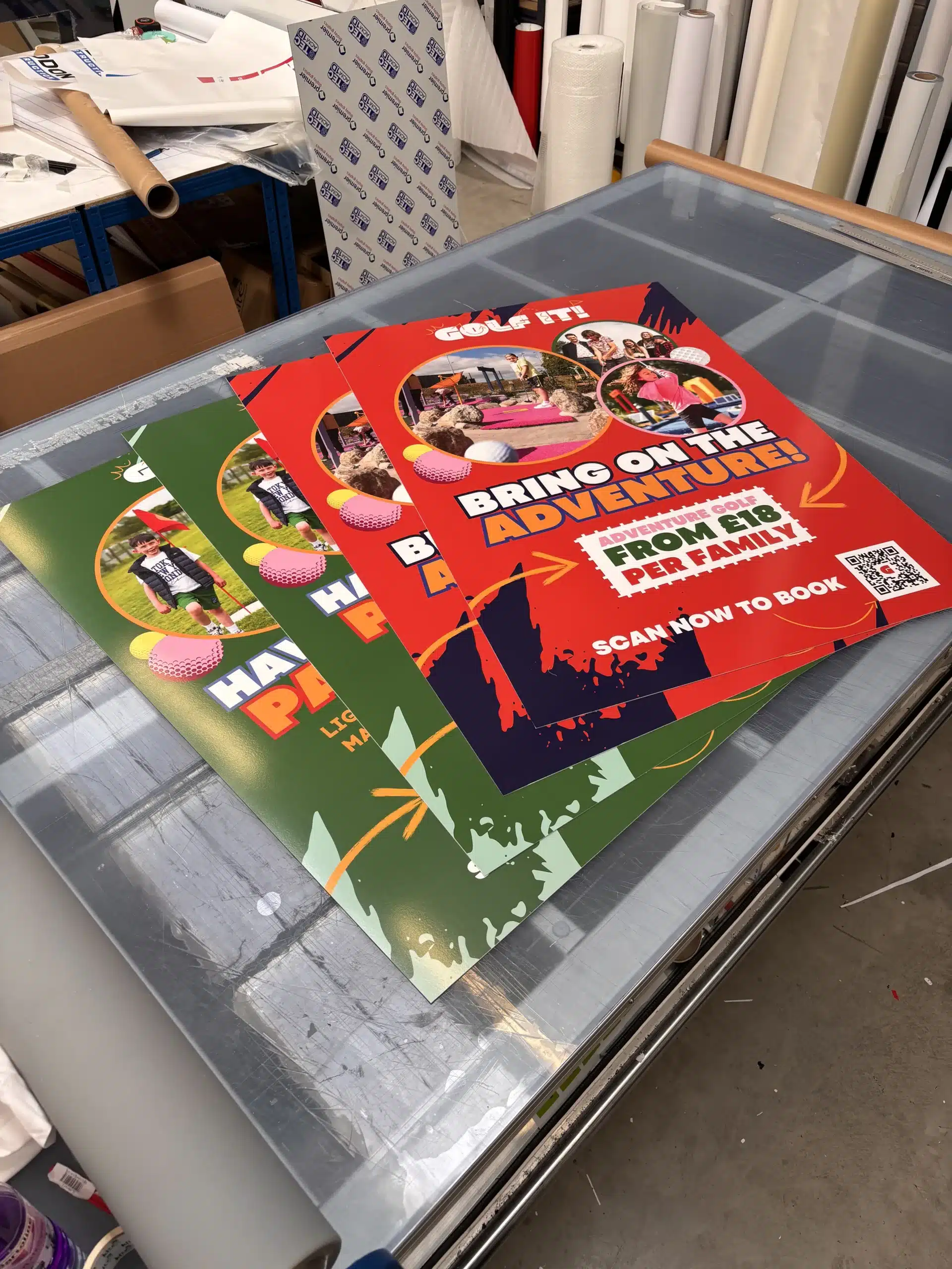
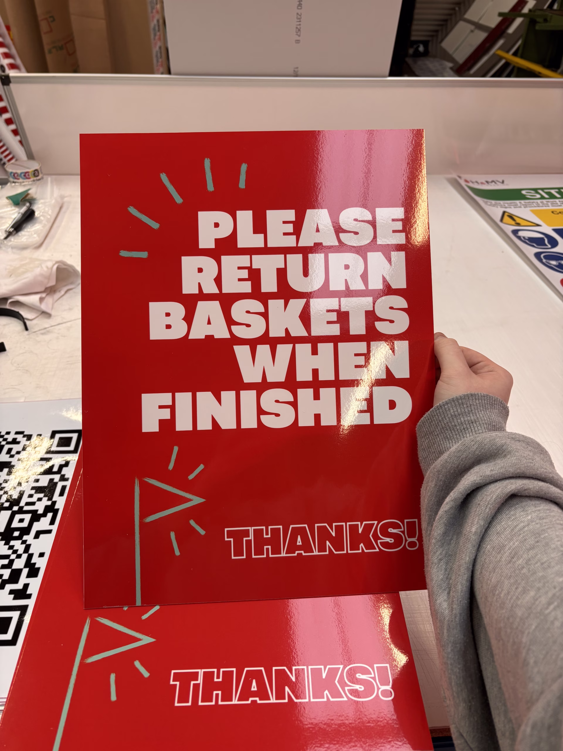
It’s tempting to include everything on a single sign: your logo, phone number, website, services, and social handles. But less really is more. Overcrowding makes signage difficult to read at a glance, which is especially hazardous on construction sites or in moving vehicles. Prioritise essential information and leave room for visual breathing space.
Expert Tip: Stick to one clear message per sign. Use hierarchy in your design to guide the viewer's eye from the most important information to the least.

Poor Font Choices
Fancy or overly stylised fonts might look good in theory, but if they can’t be read from a distance, they fail the purpose of signage entirely. Avoid script fonts or thin lettering, especially on large-format signs.
Expert Tip: Choose bold, clean fonts with high legibility. Sans-serif fonts, such as Helvetica, Futura, or Montserrat, work particularly well.

Low Contrast
A beautiful colour scheme doesn’t always translate well to signage. If there's not enough contrast between text and background, your sign could become invisible, especially in low light or from a distance.
Expert Tip: High contrast combinations like black on yellow, white on navy, or dark green on white ensure visibility. Always test your design in greyscale to check contrast.

Ignoring the Viewing Distance
A sign that looks great on a screen might be completely illegible in real life. Always consider how far away your sign will be viewed from, and design accordingly.
Expert Tip: The rule of thumb is 1 inch of letter height for every 10 feet of viewing distance. A shop sign viewed from across the street will need much larger text than a label for office use.

Forgetting Brand Consistency
Using mismatched colours, logos, or styles across different signage types can make your business look unprofessional or disorganised.
Expert Tip: Keep your signage aligned with your brand guidelines. Use consistent fonts, colours, logo placement, and tone of voice across all materials—from your site boards to your business cards.


Using Low-Quality Images or Graphics
Pixelated logos and low-resolution images instantly cheapen the appearance of your signage. This is a common issue when clients supply artwork not optimised for print.
Expert Tip: Always use high-resolution (300 DPI) files, preferably in vector format (like .ai or .svg), to ensure crisp results.

Not Factoring in Durability
Design is more than just aesthetics—functionality matters too. Outdoor signage needs to withstand weather, UV rays, and physical wear. Choosing the wrong materials can lead to faded, peeling, or broken signs.
Expert Tip: Let your sign-maker know where and how the sign will be used. At Cora Graphics, we help you choose the right materials for every environment.

Get Expert Guidance from Cora Graphics
Avoiding these common design mistakes can make all the difference in how your brand is perceived. At Cora Graphics, we combine expert design with high-quality production to create signage that not only looks good but also performs in real-world conditions.


Bad signage can really hurt a local business because first impressions are almost impossible to correct once a potential customer decides to walk away. It is vital to keep your fonts readable and your colors balanced, which is just as true for digital branding as it is for physical storefronts. A close friend of mine who runs a local bakery was trying to improve her online presence, so she started researching the digital services on https://union-street-media.pissedconsumer.com/review.html to see if their custom marketing solutions would fit her small business budget. Having a cohesive design strategy across all channels makes a massive difference in how people perceive your brand.